
― Working together since 2021
Rethinking Inventory Management for e-commerce volume sellers
Company Profile
Funded by expert Amazon Sellers, One Page Inventory was created specifically for e-commerce volume merchants struggling with the lack of efficiency of the software available on the market.
After years using numerous product inventory tools Ryan, Jon and their team started to re-think how to simplify, speed up and automate inventory management in a way that would work for every seller, retailer or supplier.
The Challenge
Inventory Management is a cumbersome task especially if you are selling hundreds of products. Most tools have a very steep learning curve and force their users to go back and forth between huge lists and detail pages to get relevant information or simply to edit quantities.
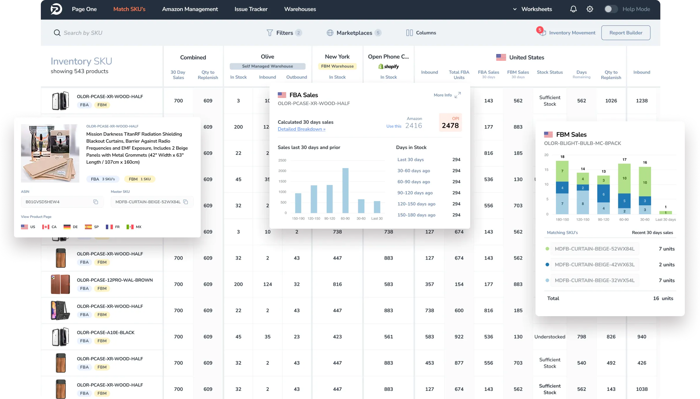
OPI's intent was to create the first inventory management application that combines dashboard layouts with deep-dive data, all in a single view. Thousands of products could be managed from one page resulting in immediate insights and actionable intelligence. Contextual help would be accessible from any part of the software, guiding the user throughout each step of the process without the need for extensive training or mentoring. A truly innovative way of managing your inventory.
The Approach
Initially invited by OPI to help with the development of their frontend application, Singular has, since then, taken a more central role on product strategy and is now leading both product design and frontend development.
Unlike other companies, when we first started working together, OPI already had a great understanding about the importance of quickly developing, launching and collecting real users feedback but these lean methodologies were solely adopted by the development team. Combining business, design and development into one T-shaped product team became instrumental in maximising throughput and quality. New features were launched faster, feedback collected regularly and users' requests became an integral part of the product roadmap.
The Solution
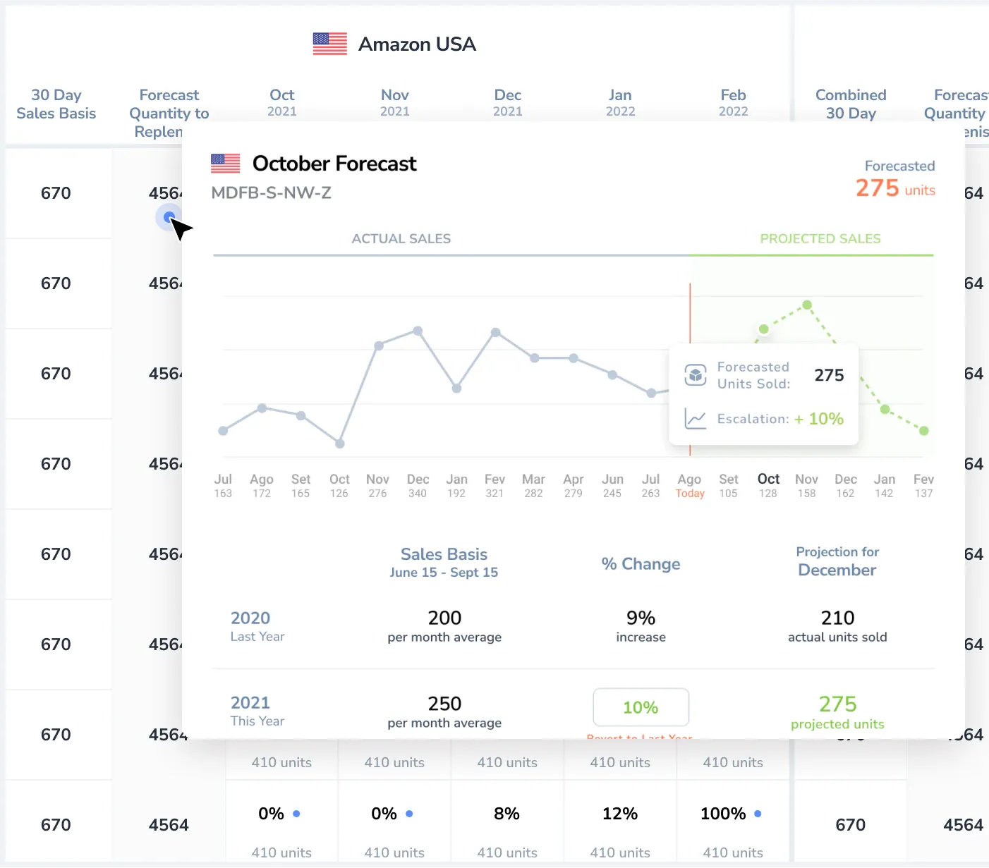
Working on an application that renders thousands of pieces of data in one page requires a delicate balance. Besides the obvious visual challenges of creating an uncluttered interface with a table-like component at its core, when we consider the amount of interactions on each screen performance becomes essential for the overall user experience. By selectively rendering on-screen elements while preloading other data we were able to guarantee a smooth experience even on low-performing computers.
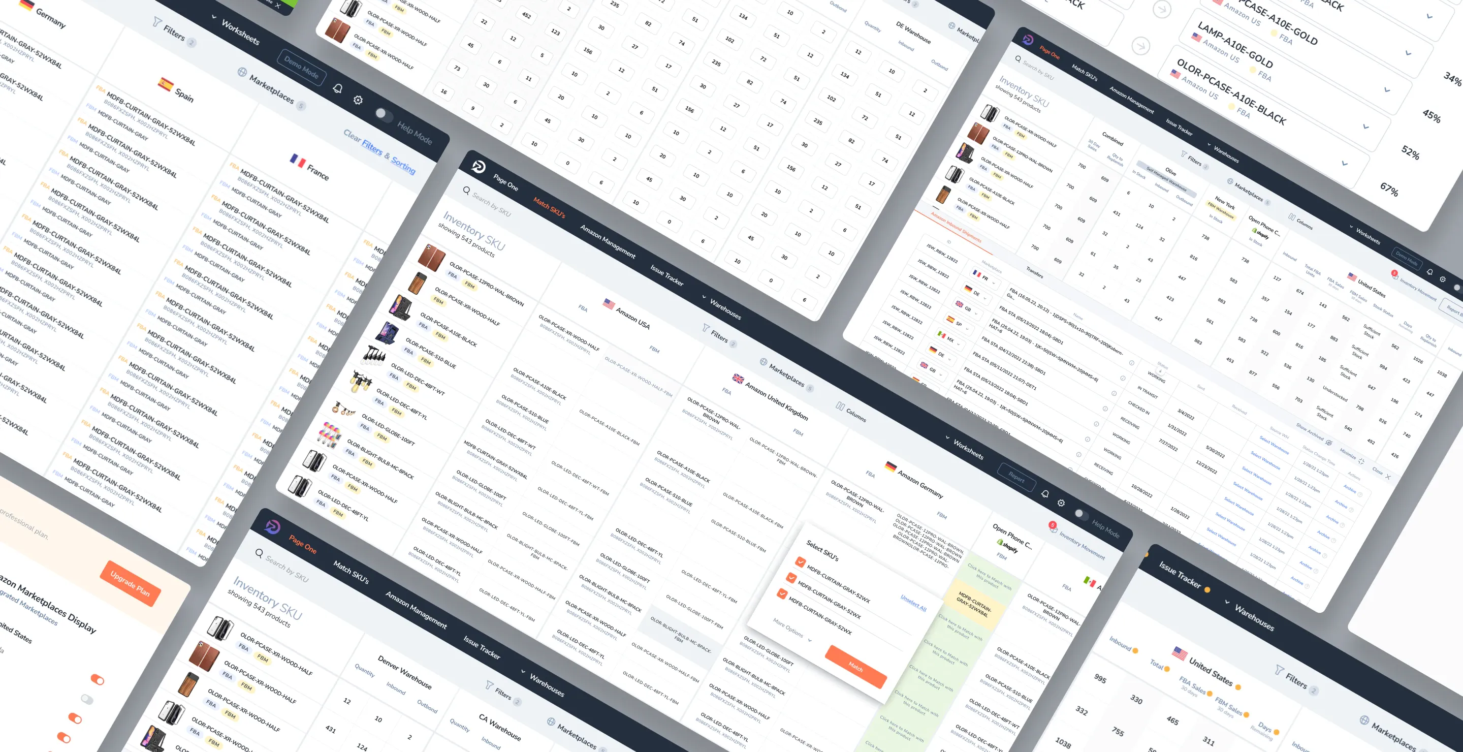
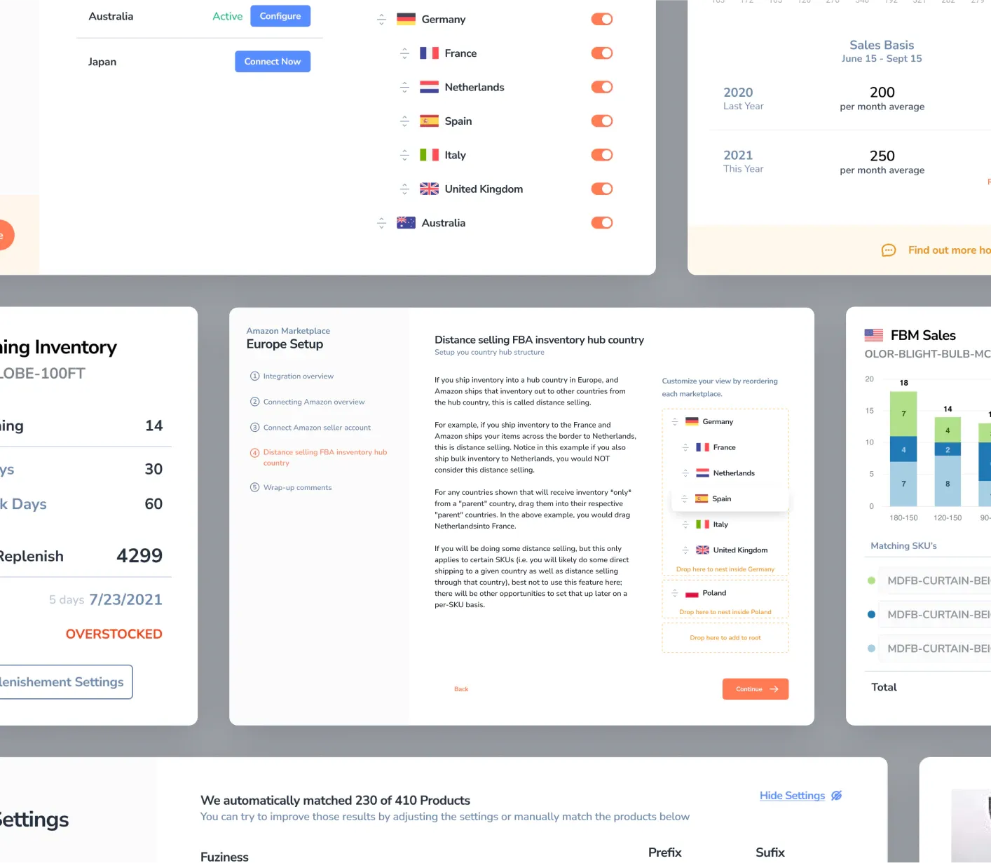
To maintain visual consistency at this scale we’ve designed and implemented a component library with reusable modules. This facilitates not only the handoff of any design assets but also significantly speeds up the implementation of new features.
Sitting on top of every screen we added “Help Mode”. A contextual help feature that, when enabled , provides bite-sized easy to read information about specific fields, actions or features, assisting the user in completing the tasks at hand as quickly as possible without needing to navigate through cumbersome manuals and FAQ pages.
The Results
As soon as the application was launched and the OPI team attended the first couple of networking events the product caught the attention of sellers by its radical departure from traditional software, its slick UX and well crafted design (their words not ours). Soon both sollo sellers and agencies rallied onto OPI not only as customers but as active stakeholders on the product direction.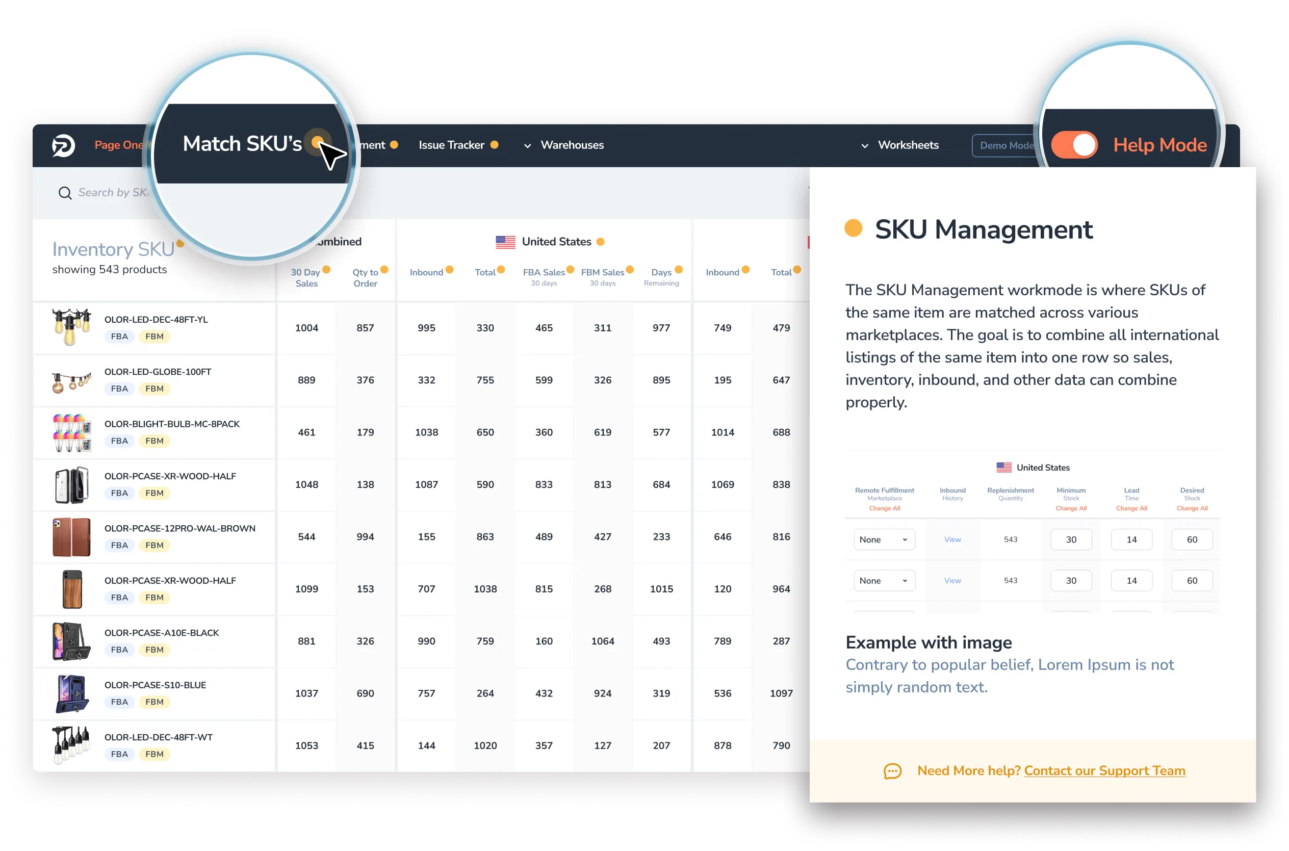
Tech Stack

Kotlin

ReactJs

GitHub

Chargebee

AWS
Summary
From the very beginning we felt that we could bring more to the table than just technical expertise and having a client that invites you to have an active voice on their product and business is uniquely rewarding. More than a great product we’ve built a great relationship. We’ve walked hand-in-hand since the very beginning and we honestly hope to be a part of OPI for years to come.


